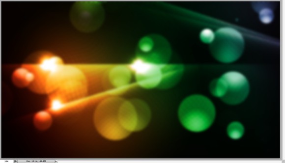
Creating the Background Swirl
The first thing we’re going to do is create a new document with the following settings:
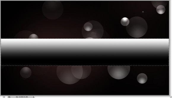
Now we’re going to add a gradient in the background from black to white. First hit the letter “D” on the keyboard to reset the foreground and background colors to default. Then, select the Gradient Tool (G) and drag from the bottom of the window to the top. You should come up with something like this:
Next we’re going to select Filter > Distort > Wave in the menu bar and use the following settings. You can change these to generate various effects.
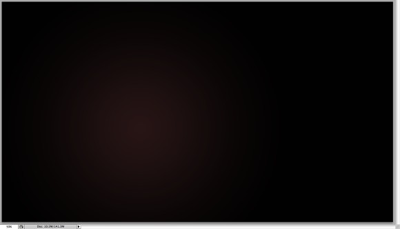
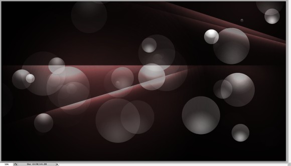
Now choose Filter > Distort > Polar Coordinates, and use the default settings. This is what it will look like:
With the layer selected choose Filter > Distort > Twirl and set the angle to about 140 degrees.
This is what we should have so far:
Now that we have our swirl base we’re going to add some cool colors. To do this select the little circle at the bottom of the layers palette and select Gradient.
After this select the rectangle to the right of the word “Gradient:” and select the gradient that looks like a rainbow and select ok.
Then, with the “Gradient Fill” box still selected, set the style to Angle and click ok.
[private_Royal]
Set this gradient layer blending mode to Color. Lets also add some more intensity to the color swirl by duplicating the original layer by selecting the original layer and pushing Command + J on the keyboard and then settings this duplicated layer to a blending mode of Overlay.
The layer order should be (from top to bottom) gradient, duplicated layer, original swirl layer. The result should look something like this:
Now we’re going to add the “King” text. Select the Type Tool and type “King.” We are going to be using the font Billboard. You can use whichever font you’d like but try to choose a thick one.
Now, we’re going to group all of our background layers (the gradient, the original swirl, and the duplicated swirl layer). Select all of these layers in the layer palette and push Command + G on the keyboard. Make sure you don’t group the text with it. Duplicate the group by right clicking the group in the layers palette and selecting “duplicate group” name the group whatever you’d like and push OK.
Now, right click on the duplicate group and select “Merge Group.” The reason we do this is because we want to perserve our original artwork and we’ll be using the flattened group to put inside the text. Make sure the flattened group is above the text layer now.
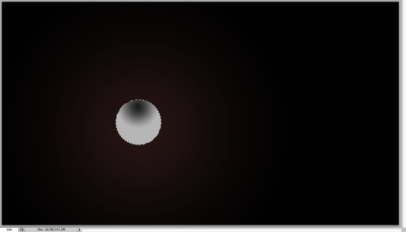
Now, Command + Left Click the thumbnail of the King text layer and you’ll see what we call “dancing ants” around the letters of K I N and G. Next, with the duplicated layer group (Group 1 copy) selected in the layers palette, choose Layer > Layer Mask > Reveal Selection from the menu bar. We’re going to name this layer “text”
We can also now delete the actual text layer so we’re only left with the following layers:
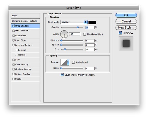
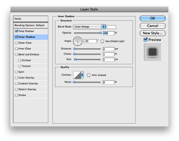
Now, we’re going to add some effects to the masked text. Select the “text” layer in the layers palette and select Layer > Layer Style > Blending Options and enter the following settings:
This is what we have so far:
Adding Gloss to the Text
Now we’re going to add the gloss to the text. Simply make sure the foreground color is set to white and with the Pen Tool click and draw a wave above the top portion of the text. Name this layer “shine.”
Now create a new layer above this “shine” layer and highlight them both in the layers palette by holding the shift key and clicking them. Once both layers are highlighted in the layers palette, select Layer > Merge Layers. Name this newly merged layer “shine” again to keep things organized. Now, Command + Left Mouse Click on the shine layer and select Select > Modify > Contract and set to 3 pixels and push ok.
With the text layer highlighted in the layers palette select Layer > Layer Mask > Reveal Selection. This will make sure the shine is within the letters.
Now, create a new layer above the shine layer and Shift + Left mouse click both layers (the new layer and the shine layer) in the layers palette so they are both highlighted and hit Command + E on your keyboard. This will flatten the new layer and the shine layer into a single layer. Again, name this layer “shine”
Adding the Gradient Mask to the newly flattened shine layer is pretty easy. Push “D” on your keyboard to make sure the foreground and background colors are set at default. Then, with the shine layer selected click the “Add layer mask” button at the bottom of the layer palette which looks like a little white circle within a square.
Select the Gradient Tool (G) and make sure the following settings are in the menu bar:
and click and drag from the top of the image down. Play until you get an effect like this:
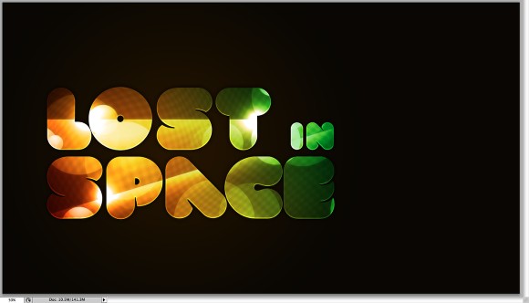
Then adjust the transparency as desired. This is what we should have so far:
Creating Glow Intensity:
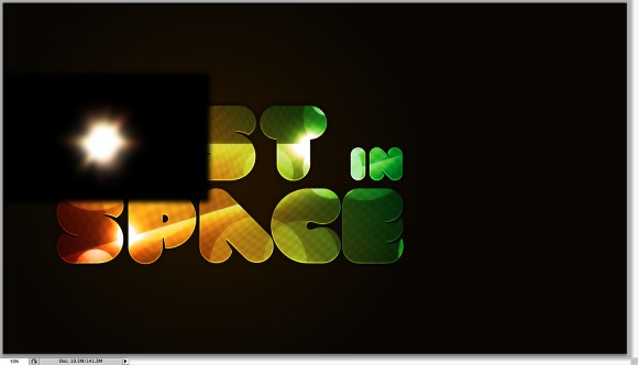
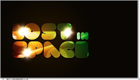
Now we’re going to create new layers and paint white on them with differing brush sizes, that all have a hardness of 0%. So create a new layer immediately above our flattened background swirl layer and select the brush tool (b). With a size of about 191 pixels with a hardness of 0% and a color of white click to draw a big dot. Select this layer to Overlay and notice how it makes the background pop. Do this until you get the desired effect. It’s a subtle difference but can make an image really stand out!
Creating Dust Particles:
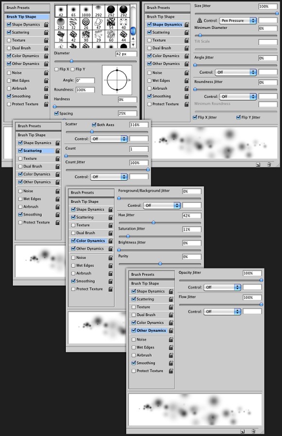
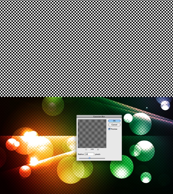
We’re going to use the same technique as above with the glow intensity dots to create our dust particles. Create a new layer immediately above the glow intensity layers but this time select a brush with diameter of 23 pixels and a hardness of 75%. Then, select the following brush settings:
Now click and create different dust particles. When you’re done set this layer to Overlay.
Creating Glowing Handwriting:
The last step we’re going to do is add some handwriting text that glows. First select the Pen Tool (P). Make sure the following settings
Also, select the brush tool and make sure the brush settings are set to a width of 4px and a hardness of 80% and make sure the color is set to white. You’ll see why we choose these settings in this next step.
Then click and using a mouse, pen tablet, or touch pad, draw the word “tutz” at the bottom right of the word “KING.”
Then, create a new layer above all other layers and with the pen tool selected right click and select “stroke path” make sure you select the box “simulate pressure” and push OK.
This is what we have so far:
The final step is to add a glow to the “tutz” we just added. To do this make sure the tutz layer is selected and select Layer > Layer Style > Outer Glow. Enter the following settings:
Good job! You’ve made it and you’ve learned a lot along the way. Using the simple steps taught in this tutorial you can take your graphic design projects to the next level.
Final Image:


